Recipe App - Input ingredients you have got by scanning the barcode or typing the name of the product(s) you can to use. Get recipes that include the ingredients you have included.
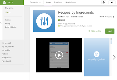
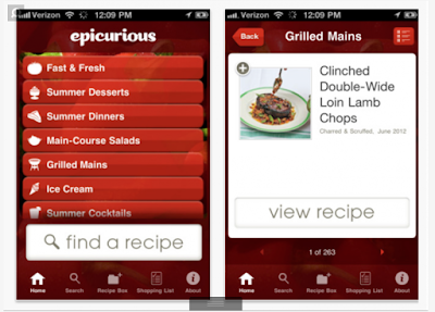
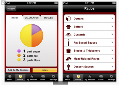
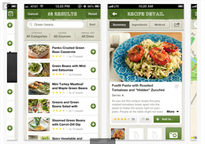

The above images are just a select few apps that are available - the idea has been done before many times.
Emergency medical app - How-to-app - An app that gives you basic instructions in the event of an A&E. e.g. If you burn yourself, what to do if someone is in shock, basic cpr etc.
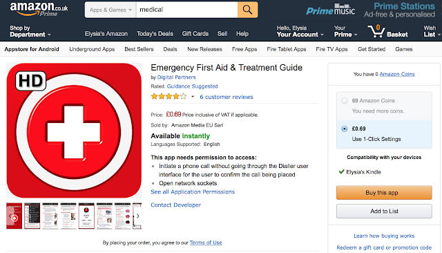
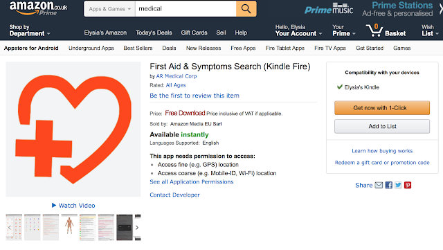


Like the first idea, the above images are just a select few apps that are available - the idea has been done before many times especially by professional companies like the British Red Cross and St John Ambulance. I don't think i would be able to add anything to this type of app.
Allergy app - Diagnosis, treatment and prevention:-
Diagnosis - Input your symptoms and what you have eaten/products you have used/injuries/insect bites etc. Gives a list of possible diagnosis' in which you can narrow down and then seek medical help for a professional diagnosis.
Treatment - Medical help. Medication/creams that will help the allergy and information as to when you should seek professional help.
Prevention:- Input your allergy and get a list of food/products etc. to stay away from. Barcode scanner and search option to identify if a certain food/product is safe for you.
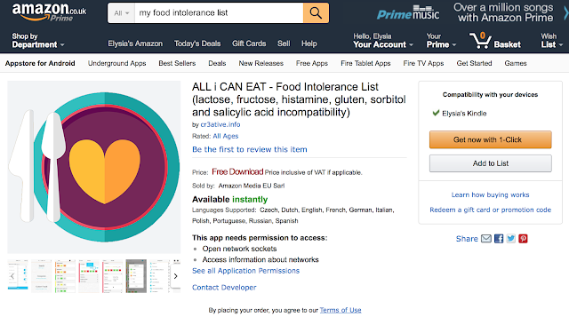
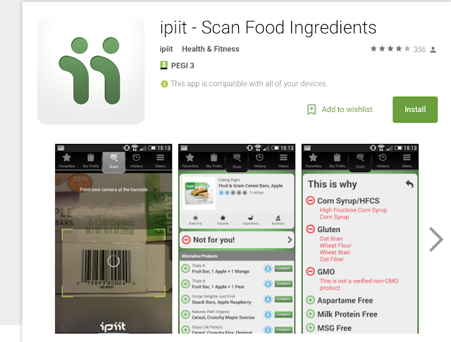


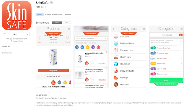
Each app only focuses on a specific type of allergy e.g. food, pollen, dermatology etc. None of them seem to diagnose, treat and give advice on preventing all in one app.
Except the pollen app, all of the apps i found used vector based images for the icon/logo. Most keep to 2 or 3 colours.
Name ideas
Allergy: Diagnose, Treat, Prevent (Allergy: DTP)
DTP Allergy
Allergy Buddy
Allergy Aid
After asking for opinions, Allergy Aid was voted the best name.
Logo Design
Above is the globally recognised symbol for an allergy. Sometimes you will see it without the border around it.
I wanted to use the star shape because it is the part of the logo that could be used without much of a copyright problem. The serpent part of the logo is more unique and people are more likely to have a problem with a company using it to their advantage/profit.
I decided to work with the letters AA for Allergy Aid. Although AA has been used for numerous other companies and groups including Alcoholics Anonymous and The Automobile Association etc, I believe that by putting the initials AA into the allergy star that it will be easily understood what AA my app is. I also plan never to use the initials outside of the logo to avoid confusion.
Class workshop of mobile screen swipe and move using After Effects
In this workshop we had to edit a basic background onto a smartphone to use as a test.
Next we had to create three screens joined together to use to swipe from one to another. I made sure to use different shades to emphasise a screen swipe.
I then added the page numbers and logo for more emphasis on the page change
The final video created on After effects shows the swipe and movement of the screens and phone.
First attempt at logo design
I had already decided to use the allergy star so that the app is easily recognisable as a allergy app. I wanted to enforce the idea that the app is for a medical purpose so i decided to add a medical cross. The only issue after deciding to put a cross in the star is how to create the initials; AA. I decided to just simply make arches. After speaking to a few people and getting opinions, I discovered that people see the medical cross under an arch but usually do not see the initials; AA until being told it is there. I decided to do a few more logo designs to see if i could make the logo more understandable in all ways.
After my first logo attempt I decided that using straight lines instead of arches would not only fit with the logo (due to the rest of the logo only using straight lines and no curves) but also would show both the initials and medical cross better. Number 2 was my first test with using straight lines. I believe it looks more aesthetically pleasing than the number 1 but it still doesn't make all aspects of the logo clear. I decided to split the initials apart a little to make it more understandable (see number 3). This attempt emphasises the initials so much that now it is hard to see the medical cross. Number 4 solves this problem and when looking at it you should easily be able to see the initials and the cross as separate aspects as well as a whole item. I was then advised to try to make the initials work better with the allergy star by putting the lines of the initials in line with the angle of the star. Number 5, 6 & 7 are all attempts to do this. However, in 5 & 7, the medical cross is warped so that it is no longer the shape a medical cross should be. Number 6 keeps the cross to the right shape but the initials are so close together that it is quite uncomfortable to look at and not as easy for the eye to see the separate aspects.
After these tests i decided that number 4 is the best logo and found that other people were of the same opinion
App Layout
I decided to keep the layout of my app simplistic so that it is easier to understand and use. I decided that symbols would help keep the simplistic feel of the app. I wanted the colour scheme to stick to greyscale and red so that the red would have more emphasis. I think using a number of greys with black and white makes it more interesting than being plain black and white but keeps it simple and not overbearing. Adding the red on top of the greyscale also gives the app a little bit of colour and stops it from seeming quite boring.
First Idea for Digital Poster
This was a basic visualisation of an idea and used internet images. The Diagnose image isn't very clear to most people; some people thought it looked like a tongue. Only people who have suffered from an allergic skin reaction can tell that it is a chest with quite a bad reaction. The treat image was simplistic and i thought that it was quite accurate because of my previous experience, however, other people thought it was not very accurate because skin allergies are often treated with cream. The prevent image was also not very clear as people didn't quite understand how it related to preventing an allergic reaction. There was also a concern that the first three images didn't explain what and who the company were very well.
Second idea for digital poster
This style of digital poster seemed a little more friendly and simplistic than the last idea which is consistent with my applications layout and functionality.
App layout
I tried to make the layout a little more interesting by creating symbols and vector imagery. The Prevent page looks better compared to the previous design except the "Products to avoid" text need to be bigger so that it can be read easily. The Treat page is better, however, once again the text needs to be bigger and the "treat me" button could be designed to look better because at the moment it seems a little boring. The Diagnose page is more visually interesting than it was but it is not very easy to read the text due to the size, also the imagery inside the vector magnifying glasses are a little unclear due to the size. Much like the "treat me" button, the "Diagnose me" button needs to be redesigned to avoid looking too plain.
This layout looks much better. It keeps to the simplistic design that i want for the app but is much more interesting than my original design. The magnifying glasses on the diagnose page will be on a carousel so that it is easier to see and read each one.
As for my homepage, menu and profile page, i redesigned them as well to see if they would look better.
Although the homepage may show continuity with the other parts of my app, I think this design looks too intense and childish. I prefer my original design for these three screens.
Treat Digital poster first attempt
This was my first attempt at creating the digital poster in After Effects. I wanted to create a basic digital poster so that i could see everything that I wanted to change and improve. The first thing I wanted to change was to give the red cross a little more character because it does not look very interesting at the moment. The next thing would be to show the treat, prevent and design in a better way that would look more visually interesting. I didn't add the app name or logo on this because it was just a test. I also think the background could be more interesting.
App layout in Adobe Xd
To show my app properly i had to add a lot of pages that would explain how it would work. Some pages are only slightly different as they are examples of how the app could be used. I made sure to keep the pages simplistic but clean because i didn't think that a difficult app design or layout would be beneficial to someone who's main interest is getting themselves help for an allergic reaction.
Animations for digital poster (These three videos are low quality due to file size reduction- for better visuals please see the digital poster)
App Demo
https://youtu.be/rVHRAS-J7bk
Digital Poster
Evaluation
Thinking about my own life lead me to think
of ideas of apps that I would want or that would be beneficial to me. After
rejecting ideas that had been done before or that I didn’t have enough
knowledge about to execute correctly, I decided to focus on allergies. I
searched through app stores but couldn’t find any apps that dealt with
diagnosing, treating and preventing most types of allergies. Since I have had a
severe allergic reaction before, I thought that an app that could give you an
idea of what type of allergic reaction you could be having, how to treat an
allergic reaction and what products to avoid in the future could be extremely
useful. Especially if like me you are allergic to a chemical that has a long
hard-to-remember name.
I think my logo will be easily recognized
due to it containing the star shape that is widely recognized as the symbol for
an allergy. I really like my final logo because of all the separate meanings
and details that are put together to create a visual image that gives people a
clear understanding of what the app is about.
My app is simplistic in layout and colour
because I wanted the app to be easy to understand and use for all age groups. I
am glad I redesigned my diagnose, treat and prevent screens because although
the original design was simplistic, it was also a little bland and boring. I
made a large number of screens quite late in the project and although they were
simple, they took a while to create due to the number of them. If I had started
designing more than just 6 screens earlier in the project I would have had more
time to experiment with the less important screens to see if I could make them
more interesting.
The app demo keeps to the simplistic style
that runs throughout my project. I didn’t want to add a voiceover because my
app is mostly self-explanatory with only a few details needing to be specified,
also I find that putting a voiceover and background music into a video can
sometimes irritate the viewer or make them focus on the wrong things. Putting a
little text and a good audio soundtrack in the video worked better for me. I
found my audio soundtrack on audionetwork.com and was able to find and buy
short mixes for a small amount of money. If I had given myself a little more
time to edit I would have been able to tweak the text a little to make it look
a little better. However, I think the demo shows the idea and details of the
app well.
For the digital poster I created 3 very
similar animations that are a little playful but also inform the viewer of the
3 main focuses of the app. The short animations are simplistic and keep
continuity with the rest of my project. After I had finished editing everything
together I watched the videos on repeat and realized that the timing could be a
little better in some areas. However, seeing the videos next to each other
going up an escalator means that the timing wouldn’t matter as much because you
would see the video again as you ascend the escalator.


No comments:
Post a Comment